How Advertisers Uncover a Brand’s Hidden Voice.How to Bring Your Unique Voice to the Forefront You know how important a brand is, even if you don’t…Read More
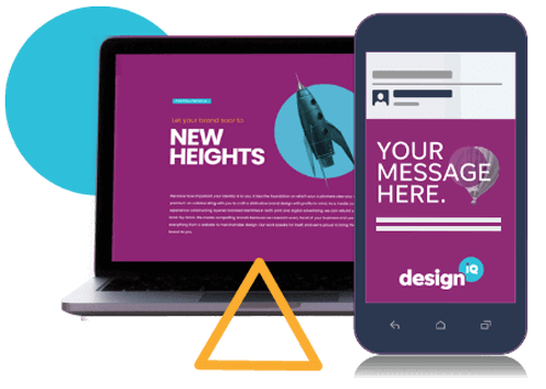
Leverage designIQ’s Creative Work From Anywhere in the U.S.DesignIQ for Creative Operations Makes Sense for You Producing attention-grabbing creative work is integral to increasing your visibility in the…Read More
Tis the Season for Effective Holiday Marketing StrategiesDesignIQ Can Help You Hone Effective Messaging The holiday season is fast approaching. Is your business prepared? Bolstering your inventory,…Read More
What Is SEO, and How Does It Work?Understanding the Benefits of SEO for Your Business Being a business owner, you face many challenges. The most crucial of…Read More
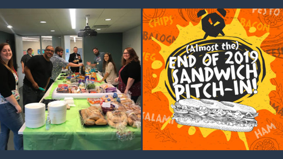
Pop-Up Food Day – No Reason NeededDo you really ever need a reason for a food day at the office? Our Indy team thought just that…Read More
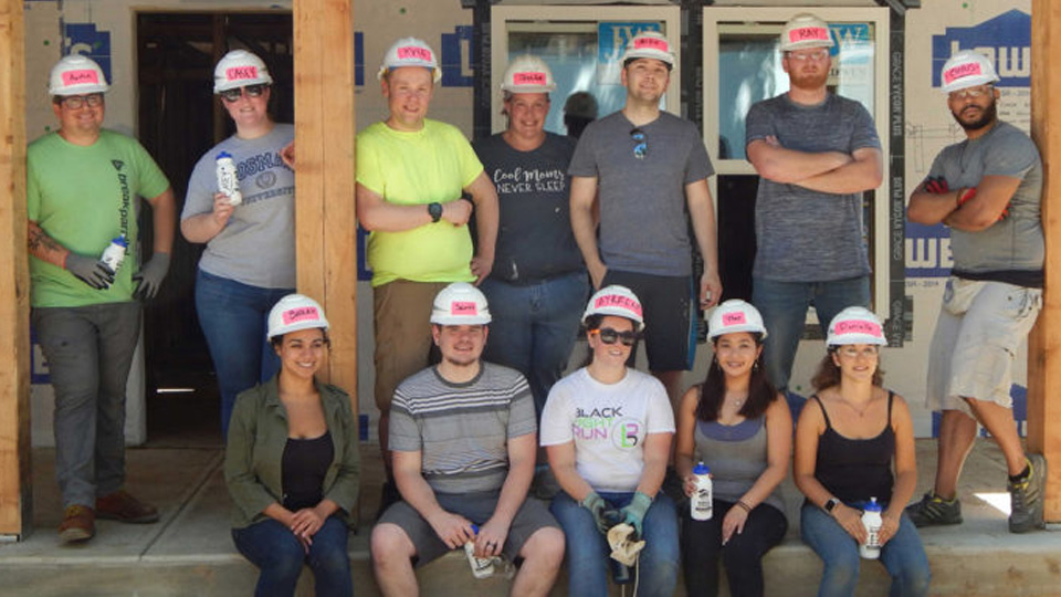
Empowering Our Local CommunitiesRecently, a small team from our Indianapolis designIQ location partnered with the Greater Indy Habitat for Humanity. Their goal was to…Read More
Appreciation Events at designIQEvery July we hold an appreciation event for the employees here at designIQ. We take great pride in each year’s…Read More
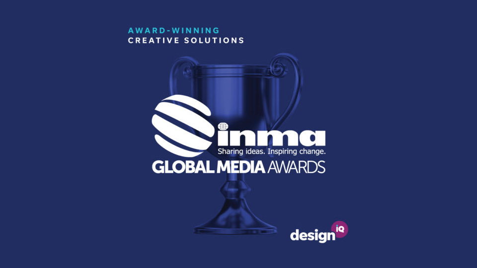
DesignIQ Wins at the INMA Global Media AwardsExciting News! Our team took home three awards for Best Execution of Print Advertising at the INMA Global Media Awards. We’re…Read More